 Supra Tabs & Accordions
Mobile First: Why Accordions are the Key to Shopify Product Page UX
When a shopper lands on your product page from a mobile device, they aren't looking for a novel; they're looking for answers. If your product specs, shipping details, and care instructions are buried at the bottom of a "wall of text," you're making them work too hard to buy from you.
Mobile traffic represents a massive portion of Shopify store visits. On a small screen, vertical space is at a premium. A product description that looks balanced on a desktop monitor can easily become an endless scroll on a smartphone. This "doom scrolling" hides critical information like dimensions, ingredients, or compatibility lists, leading to customer frustration and increased support inquiries.
Effective mobile product page ux isn't about cutting content—it's about structuring it. By using accordions, you can collapse secondary information into neat, tappable headers, allowing shoppers to scan the page and dive into the details that matter most to them.
Strategy 1: Prioritize Scannability with Stacked Sections
On mobile, users scan headers before they read paragraphs. Instead of a single "Description" block, break your content into logical, labelled sections. Common labels include "Materials & Care," "Shipping & Returns," and "Size Guide."
When these sections are presented as stacked accordion panels, the shopper sees a clear map of the available information. They can quickly find the "Ingredients" tab without having to scroll past five paragraphs of brand storytelling. This approach mirrors the mental model of a mobile user: tap to expand, tap to close.

Strategy 2: Optimize Mobile Product Page UX for "The Thumb Zone"
Mobile navigation should be effortless. Accordions provide a large, easy-to-hit target for thumbs. Unlike small links or tabs that might be difficult to tap accurately on a small screen, full-width accordion bars are highly accessible.
Ensure your accordion headers are distinct from your body text. Using a subtle border or a different background color can signal "interactivity." This is a core part of The Art of Information Architecture on product pages: making sure the user knows where the information is and how to get to it. This approach is key to modern shopify mobile design.

Strategy 3: Automatic Responsive Switching
The best product pages adapt to the device. While horizontal tabs are excellent for desktop layouts where horizontal space is abundant, they often fail on mobile by forcing users to scroll sideways or by wrapping onto multiple messy rows.
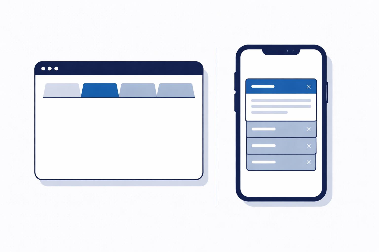
A truly responsive design switches between these two modes automatically. On a wide screen, your content might sit in four neat tabs. As the screen narrows—or as the product column itself gets tighter—those tabs should gracefully collapse into a vertical accordion stack. This ensures that no matter how your customer is browsing, the layout feels intentional and polished, utilizing stacked product sections effectively.
How Supra Tabs & Accordions Helps
Managing different layouts for mobile and desktop can be a technical headache, but Supra Tabs & Accordions makes it a single-click setting. The app is designed to solve the "wall of text" problem across your entire catalog from one central screen.
Key features for mobile accordion navigation include:
- Tabs on desktop, accordions on mobile: The app detects the width of the column it's in and switches the layout based on a merchant-defined breakpoint.
- Empty-tab hiding: If a product doesn't have "Care Instructions," that accordion panel simply won't appear, keeping the mobile interface clean.
- Twelve distinct looks: Choose from styles like "Divided rows" or "Bordered cards" to match your theme’s aesthetic without writing a line of code.
- Targeting by collection or tag: Apply your mobile-friendly accordion set to specific products or your whole catalog instantly.
- Live Preview: See exactly how your accordions will look on any product in your store directly within the Shopify editor.
By using Supra Tabs & Accordions, you can ensure that your technical specs and compliance text are always accessible but never in the way.
Conclusion
A clean, organized mobile product page builds confidence. When shoppers can find the answers they need in seconds, they are more likely to hit "Add to Cart." If your Shopify store is currently struggling with long, unreadable product descriptions, it's time to think mobile-first.
Try Supra Tabs & Accordions today—it's free and takes just minutes to set up.
Tidy up your product pages.
Tabs on desktop, accordions on mobile — set up once, applied across your catalog.
Add to Shopify